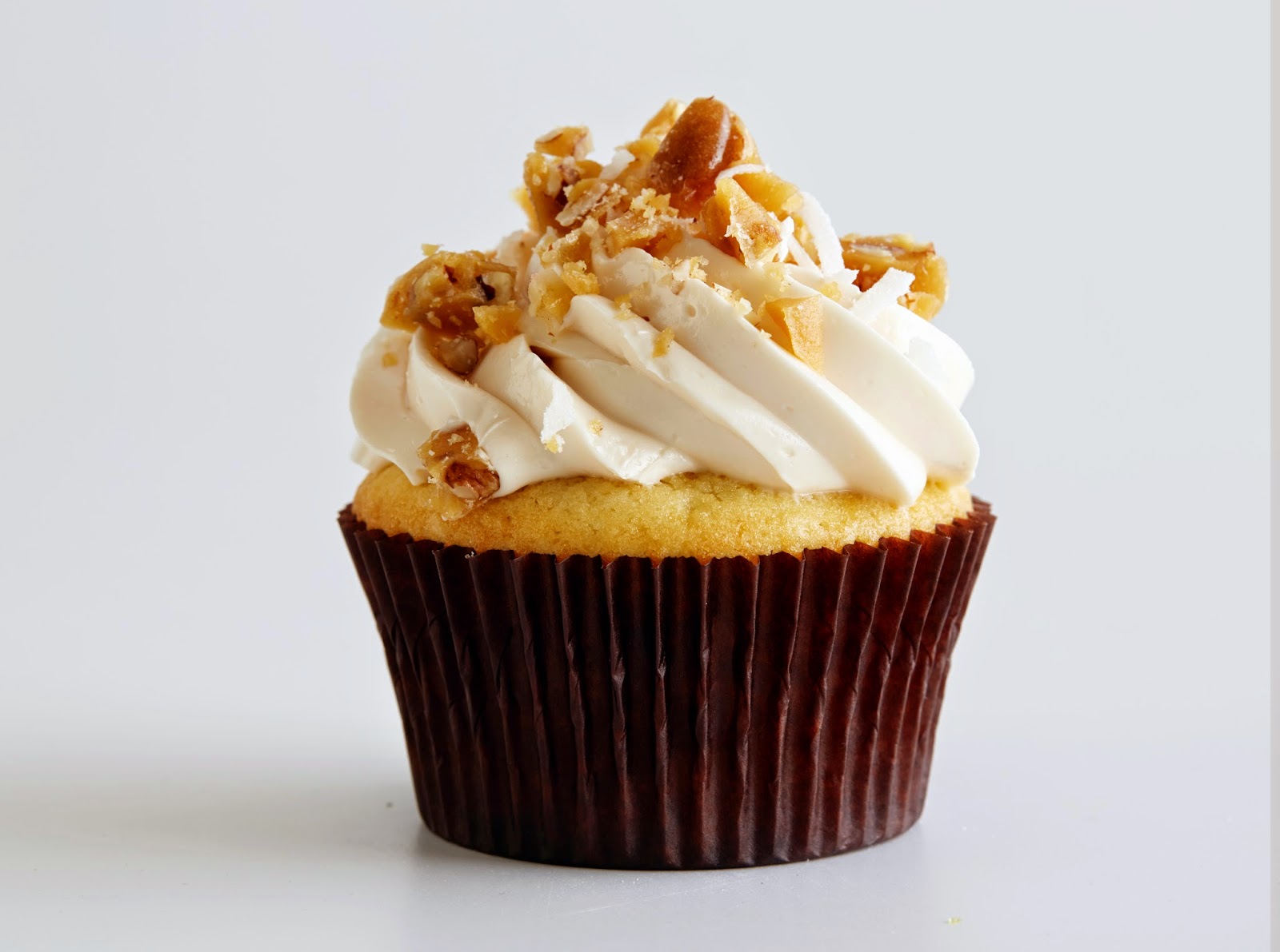
 1. "Creative Cupcakes" is introducing a new cupcake: Caramilla Avalanche! This cupcake would feature a vanilla cupcake with caramel filling and white chocolate icing with white chocolate crunches and caramel drizzled on top. The design of the cupcake could be the main focus of the logo with the name, "creative cupcakes" big and visible on the wrapper.
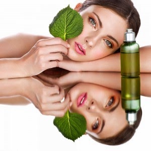
 2. "Plasmic" would be an organic makeup store. All of their products would be organic obviously and their products would range from, eyeshadows and face cleansers, to makeup brushes and bags! Their logo would probably consist of more earthy tones considering their products are organic and natural!
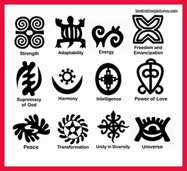
 3. "She is Strong" would be an abused women's shelter. This secure place would be a location where women who have been hurt can come to talk to therapists or even someone who is going through a similar situation. The location would also offer stress relieving activities and a place where women can regain their strength. The logo would probably be a mixture of blacks, whites, and deep reds. These colors, to me, represent strength. The logo's main focus would probably be a design similar to one featured in the picture to the right. >
4. "Under the Sea" would be an upscale seafood restaurant. I would love for the logo to have more of a cartoony feel. For example, maybe have fun sea creatures holding the name of the restaurant up, or an expensive fish blowing bubbles, and the name would be in one of the bubbles. This company could also be launching a new product but I'm not sure what I could make up without getting the design too intense. The color scale for this logo would be greens, blues, and maybe some coral colors.
 5. "Hammock Heaven" would be an area for teens and young adults to come hang around and relax. The area would be located in a huge building, where inside hammocks would hang over large white, fluffy, cloud-looking pillows. The logo for this idea could be the name shaped into a hammock with rays of light coming from behind, or possibly the name curved on a bed of clouds. The colors would be tans and white.


